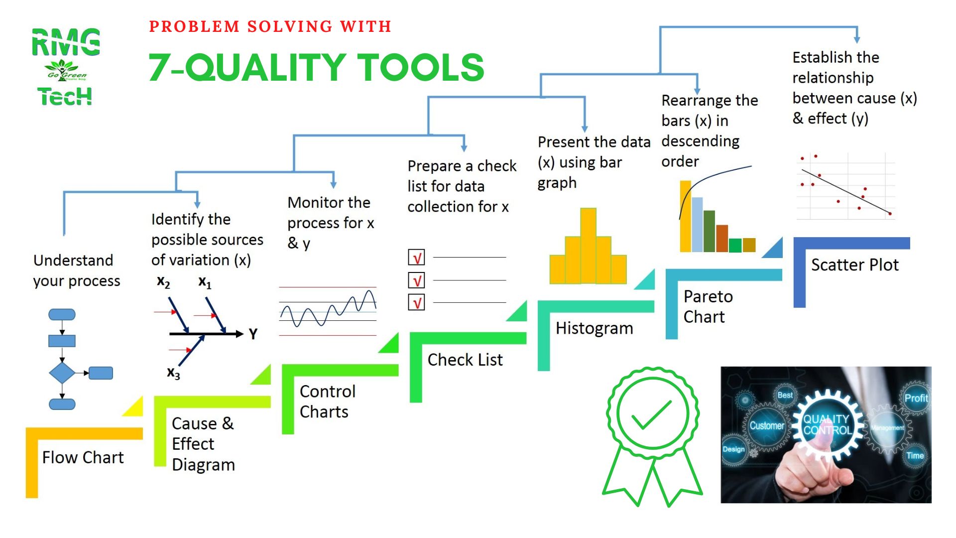
What is QC Tool? What is 7QC tool?
7 QC Tool is the basic quality control tool, with the help of which we solve the quality related problem, in this we first collect the data, then analyze the data, after analyzing the data we find the original problem.
What is QC Tool?
After that we take action on the problem and see the result. 7 QC Tools work on numerical data. 7 Quality Control Tool reduce the defect, and improve the quality of the product.
What are the 7-QC tools?
- Check sheet / check seat
- Pareto analysis / Pareto chart
- Scatter diagram
- Cause and effect diagram
- Flowchart
- Histogram
- Control chart
1. Check Sheet
“We use Check Sheet to collect data, in this we collect data by going to the real time – real location where the data is being generated”
Check Sheet is a type of manual sheet, on which data is filled manually, it is also called Telly Sheet, because in this we also collect Quantitative lnformation and tell the tell mark. We can also use the information obtained from the check seat to plot a histogram graph.
It is a blank form, which is made to collect data in an easy way, this data can be of both Quantitative or Qualitative types.
There are 5 types of check sheets.
- Attribute check sheet
- variable check sheet
- location check sheet
- Cause check sheet
- Check- confirmation check sheet
2. Pareto analysis / Pareto chart
"Pareto Chart is a simple diagram, in which there is one X-axis and two Y-xis (on either side of the chart) in which we write the problems, defects, or other parameters in decreasing order"
We cannot solve all the problems at once, we have to divide them according to need, what is more important first, rest later.
Pareto Chart is made with the help of “Bar” graph and “Line” graph, in which Bar is used to represent the value, so that we write in decreasing order, it was discovered by Vilfredo Pareto. That's why the Pareto chart is named after him, it works on the 80-20 rule.
3. Scatter Diagram / Scatter Chart
“Scatter Diagram is a Graphical Tool, it shows the relationship between Independent and Dependent Variables, it was developed by Dr. Created by Kaoru Ishikawa”
Due to its occurrence in any problem and what is the effect due to those reasons, all this data is recorded, then Scatter Chart is made through it, from this we come to know that what and which of those two variables type of relationship.
4. Cause and Effect Diagram / Cause and Effect Diagram
In 7 QC Tool, Fishbone Diagram is used to find out the possible causes of any problem or problem arising in any process, and then with the help of this, it is found out the main reason. In this we see the relationship between Cause and Effect.
Cause and effect diagram was created by Professor Kaoru Ishikawa in 1949, hence it is also called Ishikawa Diagram.
Its structure looks like a fish bone, that's why we also call it Fishbone Diagram.
Cause and effect diagram helps in the analysis of any problem, it tells every possible cause of the problem, it does not tell about the direct root cause, but first we can analyze the problem before it arises. By knowing every possible reason, you can reach the main reason.
5. Process Flow Chart (7 QC Tools)
The first tool in 7 QC Tool is Process Flow Chart, through this it is easy for us to understand the sequence of any process.
It shows any process in the form of a step-by-step graphical diagram, it contains many types of symbols, which show different processes, which are connected by an arrow.
- Type of flow chart
- process flow chart
- data flow chart
- business process modeling diagram
6. Histogram / Histogram
"Histogram is a graph, which shows the frequency distribution of numerical data taken in a time interval by a bar graph."
Histogram helps to summarize the data taken from the process and helps us to understand if there is any change in the process. It also tells about the process whether the process can meet the customer's demand or not.
To use histogram, we must have numerical data. The more the data, the better will be the result of the analysis.
7. Control chart
“Control Charts show the variation in the process, how much it is fluctuating, and what is the reason behind it”
main parts of control chart
- LCL and UCL :- These are the limits of control.
- X-Bar :- It shows the average process.
- No Action Zone :- It is between +1σ to -1σ.
- Warning Zone :- This zone


Georgia Reader Reply
Very informative and simple to understand, thanks a lot for this training presentation.